We often use panelFormLayout component as a standard approach to align our input controls and their labels on our pages. According to the documentation the component usually contains ADF Faces input components whose names start with 'input' (like inputText and inputDate) and components that start with 'select' (like selectOneChoice, selectBooleanRadio, and selectManyChoice). When more complex field content is needed, we should use a panelLabelAndMessage around the content. In such case panelFormLayout draws the label on the left side and all the content of the panelLabelAndMessage on the right side. Sometimes we need to have an icon rendered before the label. There are two predefined icons we can get rendered before the label using panelLabelAndMessage and its attributes showRequired and changed.
So, in case of showRequired=true it looks like this:

And in case of changed="true" it looks like this:

But when we need our custom icon to be rendered, we use panelLabelAndMessage's attribute labelStyle. The attribute is used to provide a custom CSS style for the "label" part of the panelLabelAndMessage component. So, in order to get our custom icon rendered we will use the following piece of code:
And it looks like this:
So, in case of showRequired=true it looks like this:

And in case of changed="true" it looks like this:

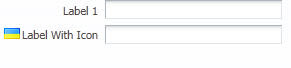
But when we need our custom icon to be rendered, we use panelLabelAndMessage's attribute labelStyle. The attribute is used to provide a custom CSS style for the "label" part of the panelLabelAndMessage component. So, in order to get our custom icon rendered we will use the following piece of code:
<af:panelLabelAndMessage label="Label With Icon" id="plam1"
   labelStyle="background: transparent url(UA.png) no-repeat center left;
               padding: 3px 0 1px 18px;">
   <af:inputText id="it2" simple="true"/>
 </af:panelLabelAndMessage>
And it looks like this:

No comments:
Post a Comment
Post Comment